

10 Usability Principles for User Interface Design
Not many people know this, but in my UI/UX design career, I am a big fan of the Nielsen Norman Group. Whenever I need insights into UX, I turn to the expertise of this experienced team and its co-founder, Jakob Nielsen.
In 1991, Tim Berners-Lee created the internet — or more precisely, he developed the World Wide Web (WWW) software, which included a text-based browser, a web server, and a developer library.
Just a few years later, on April 24, 1994, Jakob Nielsen published his famous article, “10 Usability Heuristics for User Interface Design” (updated on January 30, 2024). It’s remarkable to think that this happened only three years after the first WWW software was introduced!
The Nielsen Norman Group has been researching UI/UX design since its inception and continues to do so today—for over 30 years. I find this truly inspiring.
I don’t believe in large-scale projects with a lifetime of just 1-2 years, or even 5 years. Of course, there is always room for hype, but this article is not about landing pages (LP) that are typically launched to boost conversion rates or promote short-term offers, products, or services.
What truly inspires me are projects that endure over time and bring real value to the world. Products that continuously enhance their User Interface (UI) and User Experience (UX) for years, evolving, adapting to new technologies, and expanding further—these are the real success stories.
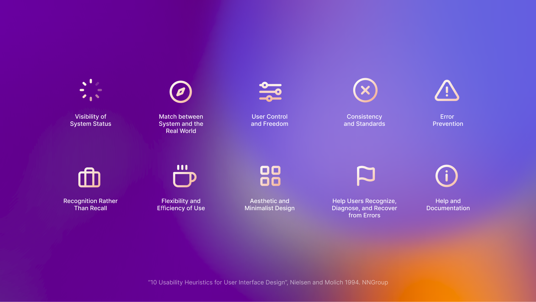
In this article, I’ll walk you through the 10 Principles for User Interface Design that have stood the test of time and proven their effectiveness:
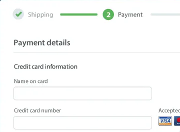
1. Visibility of System Status
Definition: The design should always keep users informed about what is going on, through appropriate feedback within a reasonable amount of time.
- “You Are Here” maps. Interactive mall maps have to show people where they currently are, to help them understand where to go next.
- Checkout flow. Multistep processes show users which steps they’ve completed, they’re currently working on, and what comes next.
- Phone tap. Touchscreen UIs need to reassure users that their taps have an effect — often through visual change or haptic feedback.
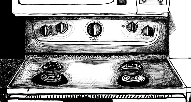
Illustration by Sara Pimental
2. Match between System and the Real World
Definition: The design should speak the users’ language. Use words, phrases, and concepts familiar to the user, rather than internal jargon. Follow real-world conventions, making information appear in a natural and logical order.
- Shopping cart icon. A shopping cart icon is easily recognizable because that feature serves the same purpose as its real-life counterpart.
- “Car” vs. “automobile”. If users think about this object as a “car,” use that as the label instead.
- Stovetop controls. When stovetop controls match the layout of heating elements, users can quickly understand which control maps to each heating element.
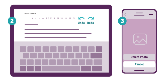
Illustration by Nielsen Norman Group
3. User Control and Freedom
Definition: Users o en perform actions by mistake. They need a clearly marked “emergency exit” to leave the unwanted action without having to go through an extended process.
- Exit sign. Digital spaces need quick “emergency” exits, just like physical spaces do.
- Undo and redo. These functions give users freedom because they don’t have worry about their actions — everything is easily reversible.
- Cancel button. Users shouldn’t have to commit to a process once it’s started — they should be able to easily cancel and abandon.
4. Consistency and Standards
Definition: Users should not have to wonder whether different words, situations, or actions mean the same thing. Follow platform and industry conventions.
- Notifications. A standardized notification design provides a similar but distinguishable look and feel for different app pop-ups.
- Design system. Using elements from the same design system across the product lines lowers the learning curve of users.
- Check-in counter. Check-in counters are usually located at the front of hotels. This consistency meets customers’ expectations.
5. Error Prevention
Definition: Good error messages are important, but the best designs carefully prevent problems from occuring in the first place. Either eliminate error-prone conditions, or check for them and present users with a confirmation option before they commit to the action.
- Date selection on calendar. Offer good defaults and set boundaries when people book services by dates. Grey out unavailable options.
- Guard rails. Guard rails on curvy mountain roads prevent drivers from falling off of cliffs.
- Airline confirmation. The confirmation page before checking out on airline websites gives users another chance to review the flight details.
6. Recognition Rather Than Recall
Definition: Minimize the user’s memory load by making elements, actions, and options visible. The user should not have to remember information from one part of the interface to another. Information required to use the design should be visible or easily retrievable when needed.
- Search. Search queries are presented together with the results as a reference.
- Comparison table. Comparison tables list key differences so that users don’t need to remember them to make comparisons.
- Lisbon. People are more likely to correctly answer the question “Is Lisbon the capital of Portugal?” rather than “What’s the capital of Portugal?”
7. Flexibility and Efficiency of Use
Definition: Shortcuts — hidden from novice users — may speed up the interaction for the expert user such that the design can cater to both inexperienced and experienced users. Allow users to tailor frequent actions.
- Shortcuts. Regular routes are listed on maps, but locals with more knowledge of the area can take shortcuts.
- Tap to like. Social apps allow two ways to like posts. Experienced users can tap to like because it speeds up their browsing.
- Keyboard shortcut. Keyboard shortcuts for complex products can help expert users finish their tasks more efficiently.
8. Aesthetic and Minimalist Design
Definition Interfaces should not contain information which is irrelevant or rarely needed. Every extra unit of information in an interface competes with the relevant units of information and diminishes their relative visibility.
- Messy vs organized. UI Messy UI increases the interaction cost for users to find their desired content; Organized UI lowers the cost.
- Ornate vs. simple teapot. Excessive decorative elements can interfere with usability.
- Communicate, don’t decorate. Over-decoration can cause distraction and make it harder for people to get the core information they need.
9. Help Users Recognize, Diagnose, and Recover from Errors
Definition: Error messages should be expressed in plain language (no error codes), precisely indicate the problem, and constructively suggest a solution.
- No search results. Provide useful help when people encounter search-result pages returning zero results, such as popular topics.
- Internet connection error. Good internet connection error pages show what happened and constructively instruct users on how to fix the problem.
- Wrong way sign. Wrong-way signs on the road remind drivers that they are heading in the wrong direction and ask them to stop.
10. Help and Documentation
Definition: It’s best if the design doesn’t need any additional explanation. However, it may be necessary to provide documentation to help users understand how to complete their tasks.
- Information icon. Information icons reveal tooltips to explain jargon when users touch or hover over them, which provides contextual help.
- Frequently asked questions. Good frequently-asked-question pages anticipate and provide the helpful information that users might need.
- Airport information center. Information kiosks at airports are easily recognizable and solve customers’ problems in context and immediately.
”10 Usability Heuristics for User Interface Design” Jakob Nielsen article Link 🔗
Comments are closed.